My work.
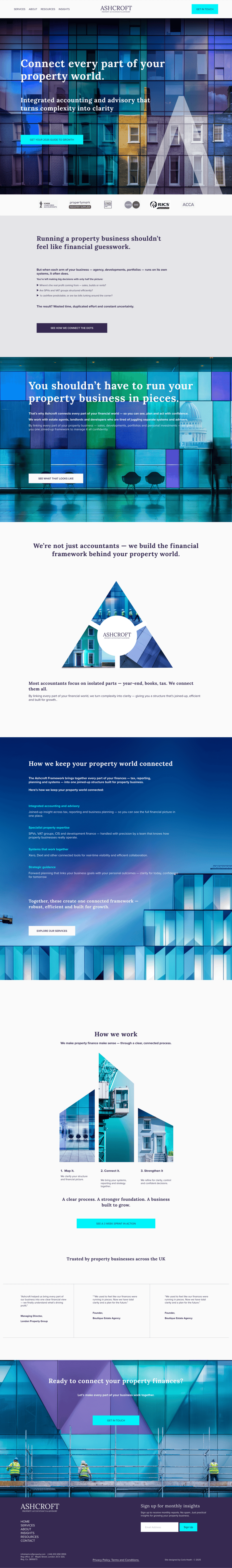
Ashcroft Accounting case study.
Repositioning an accounting firm to clearly own its niche in a competitive market.
The brief.
Ashcroft Accounting was the concept project I used to test my new Clarity Sprint — a three-week process combining brand strategy, messaging and website design.
The aim was to show how a joined-up sprint could turn a business that was solid but generic into a clear, engaging proposition, with a confident brand and a website built to convert.
The concept was shaped using insight from my network - friends who run property management and estate agency firms, and an ex-accounting client, grounding it in real-world challenges across the property sector.
Using a test study also let me show the kind of strategic thinking that’s usually kept behind closed doors. (Let’s face it - no business wants its positioning laybook made public).
What I set out to do
▷ Define a clear, ownable position across the full property ecosystem.
▷ Create a distinctive brand identity and visual system built on connection.
▷ Build a website that turns financial complexity into clarity.
The strategy.
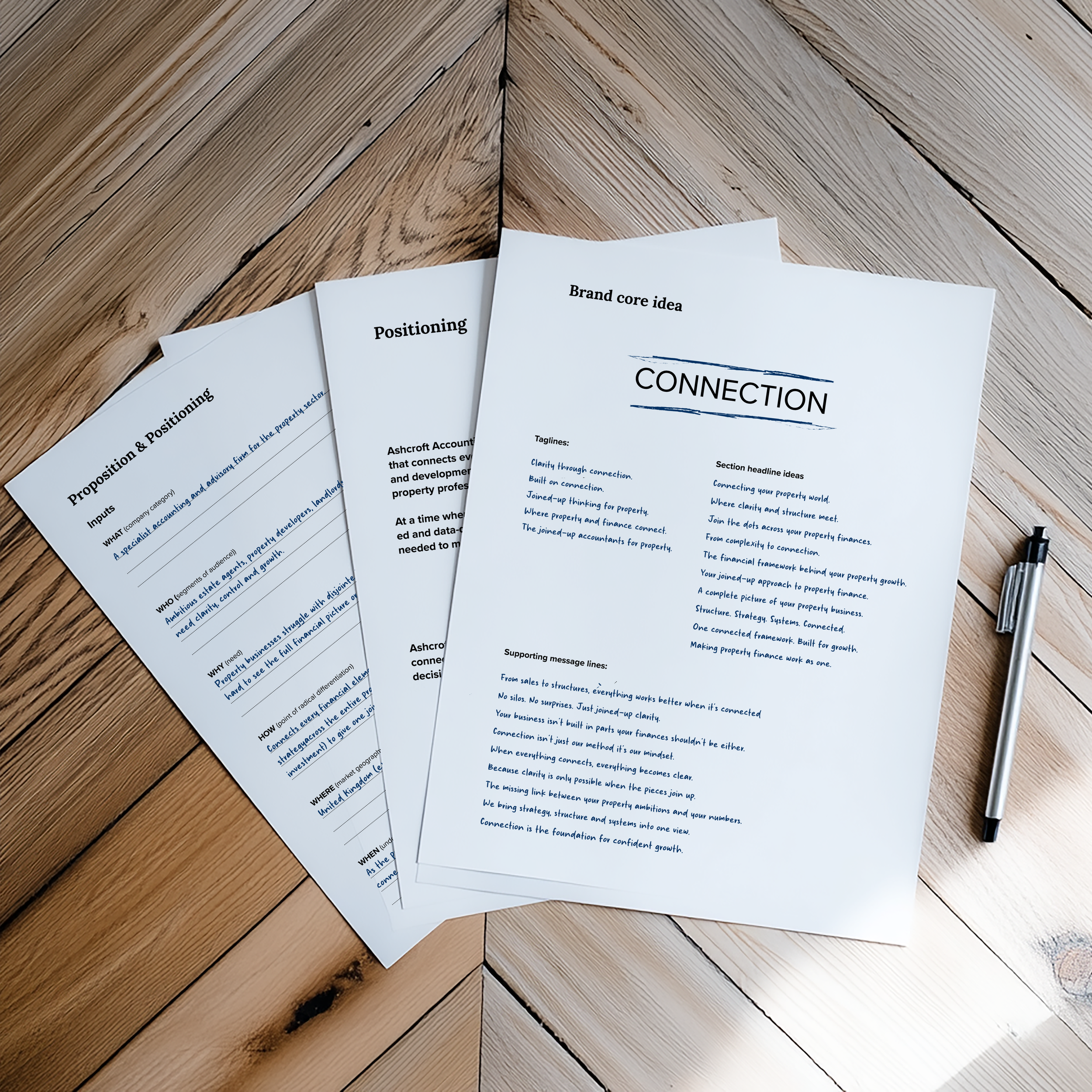
Brand positioning
Most accountancy firms focus on one corner of the property market — estate agents, landlords or developers.
Ashcroft was built to bridge them all. The opportunity was to become the connector: linking every financial strand of a client’s property world into one joined-up system.
The positioning idea, connection — symbolised everything Ashcroft stood for: how they integrate accounts, tax, systems and advice, and the way they connect across sectors to give clients a full, clear financial picture.
Brand architecture
I structured the brand around Ashcroft Property Accounting & Advisory, a specialist division that could flex to cover agency, development and investment audiences under one coherent identity.
This reinforced the core concept of connection — every service, every client type, working as part of a single financial framework.
The brand.
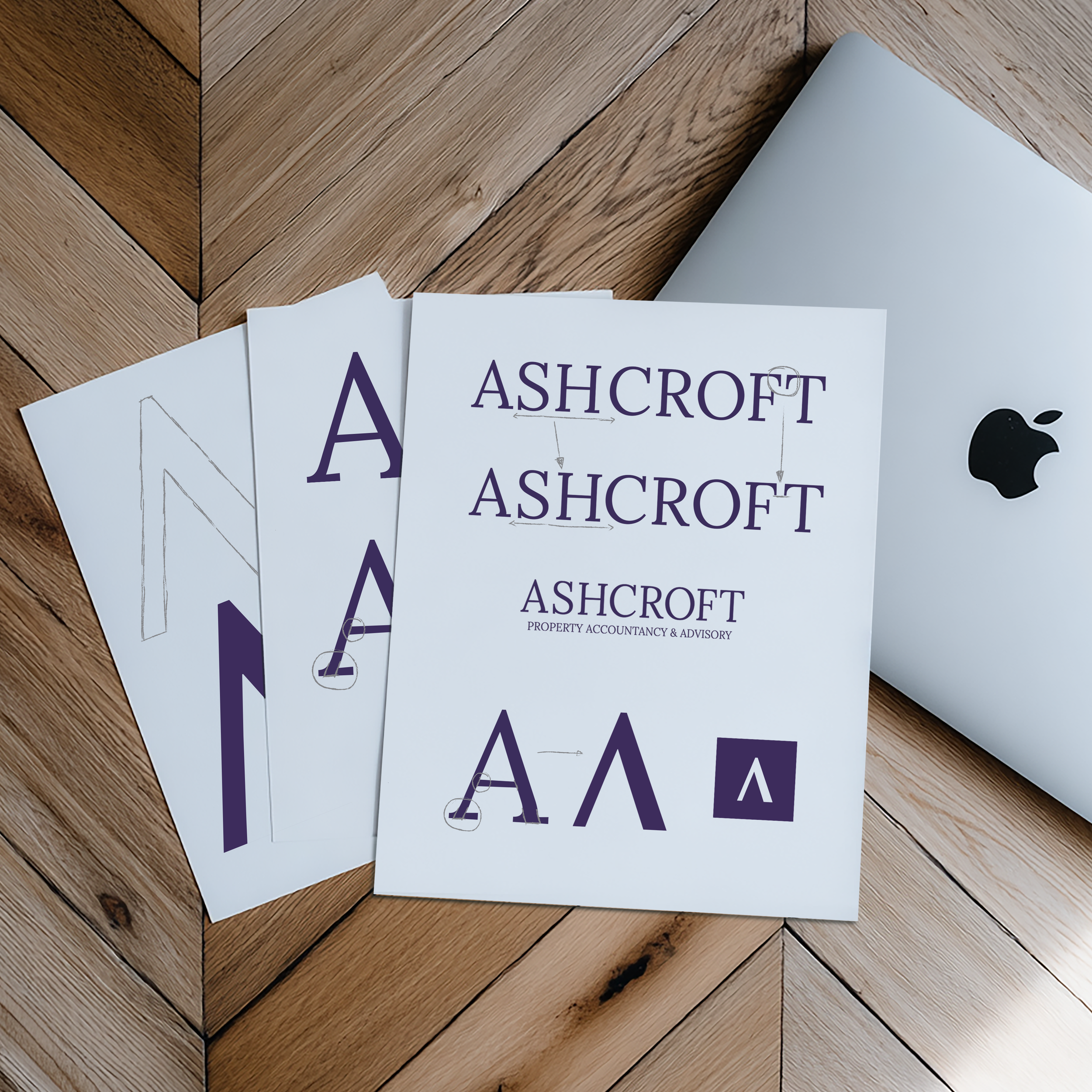
Visual identity system
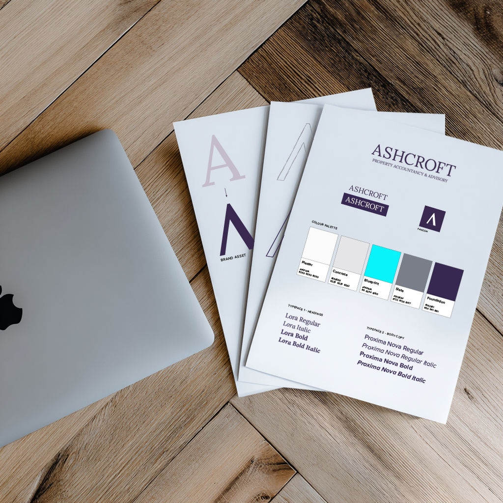
The new identity balances structure and connection - pairing a confident serif wordmark with geometric precision and soft tonal depth.
Its palette draws from architectural materials — slate, glass blue and soft stone — creating a sense of clarity and depth.
At its centre sits the triangular ‘A’ mark, adapted from the logo and representing the three connected pillars of the property world: agency, development and investment..

Imagery & expression
AI-generated imagery replaced stock photos, creating a visual world of light, glass and connection.
Every visual is designed to feel transparent and interconnected — echoing Ashcroft’s promise to help clients see the bigger picture.
The result.
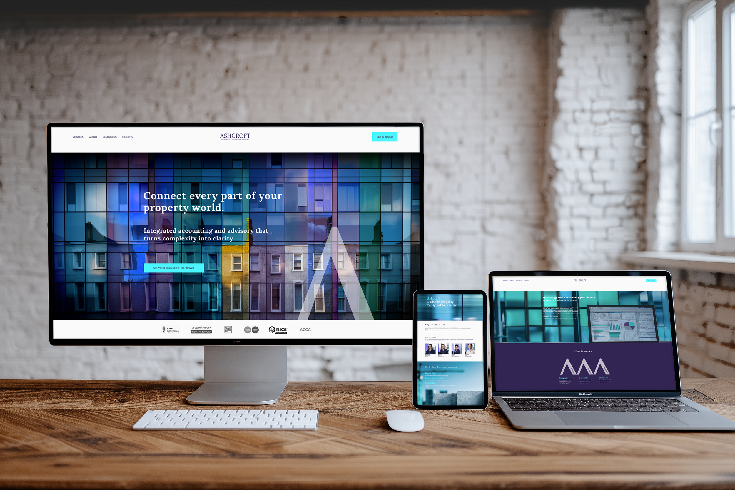
The concept brand came to life through a fully realised Squarespace site — proof that clarity, connection and creativity can be delivered in one streamlined sprint.
And a once-generic accounting firm was reimagined as a confident, connected brand for the property sector — with a clear story, joined-up offer and a website designed to turn complexity into clarity.
↓ Scroll the homepage ↓
Other brilliant brands I’ve worked with.
While my focus now is on smaller, expert-led businesses, I’ve spent years helping shape the strategy, voice and creative for some of the UK’s most recognisable brands — experience that now fuels every sprint I run.


These days, I bring that big-brand clarity and creative discipline to smaller expert-led businesses — through fast, focused sprints that get your brand clear, your message sharp, and your website live.
[See my services →]