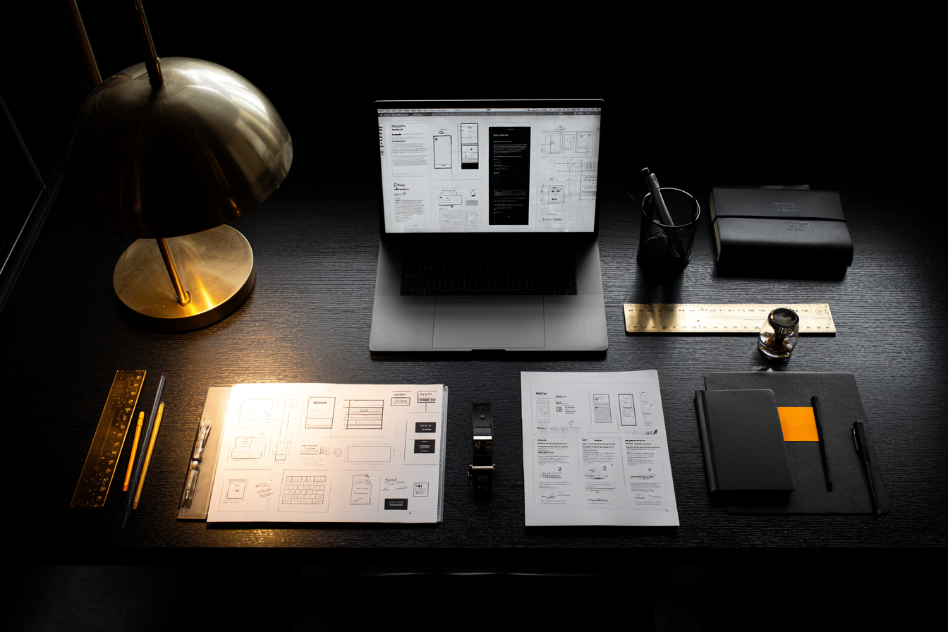
Be Q. Not James Bond.
Most B2B service websites have the same problem…
… they try to sound impressive. And accidentally end up sounding vague.
That’s when the right buyers leave — not because you’re not good.
But because your site doesn’t make it easy to choose you.
Lots of B2B service firms build sites that try to sound impressive, confident, and a bit untouchable. But B2B buyers aren’t looking for a star. They’re looking for a safe pair of hands.
They want to know, fast:
Do you get my problem?
Is this for someone like me?
Will choosing you reduce risk… or create more of it?
That’s why the Bond metaphor works.
Bond gets the glory.
Q makes the mission possible.
When your website makes you the hero, visitors have to work hard to translate what you do into what they need. When your website makes your client the hero, you become the guide they trust — and it becomes much easier for the right people to take the next step.
Why a “James Bond” website quietly loses work
Most visitors don’t arrive thinking, “I wonder how brilliant this company is.”
They arrive thinking:
“Can you help me with my problem?”
“And is this going to go wrong if I choose you?”
A “look how great we are” website adds friction. Big claims. Vague promises. Lots of effort for the reader. Most won’t bother. They’ll click back and pick the business that speaks in plain English.
Signs your website is playing Bond
You can usually spot it in seconds:
You lead with “We are a leading…” and never leave.
The hero image is a stock photo of a team laughing at salads.
There’s a long awards list, then a long service list, then “excellence”.
Everything is “innovative”, “end-to-end”, “world-class”… and somehow still unclear.
None of that answers the real question in the buyer’s head: “Is this for someone like me — with my deadlines, my internal politics, and my risks?”
Here’s the shift in one headline:
Before (Bond): “We deliver best-in-class finance transformation.”
After (Q): “We help finance teams close faster. With fewer surprises.”
Same capability. Different centre of gravity.
How B2B buyers actually read your site
They don’t read. They scan. In a few seconds, they’re trying to work out:
Who you help
What you help them achieve
Whether you feel credible and safe
How hard it will be to get started
They don’t need a heroic monologue. They need a guide who sounds calm when things get tricky.
Write like Q
Q doesn’t shout. Q doesn’t posture. Q doesn’t make it about himself. He’s prepared, practical, and trusted. That’s the role your website needs you to play. Here are the simplest changes that create that “safe pair of hands” feeling.
1. Start with a client-first hero line
Your first screen should feel instantly recognisable to the right person.
A simple structure:
We help [type of client] achieve [result].
Without [pain / risk / fear].
Keep it concrete. Keep it human. If your headline could sit on any competitor site, it’s too vague.
2. Use your client’s words, not your internal labels
Clients trust language that sounds like real life. Look at: sales calls, objections, onboarding forms, LinkedIn messages, reviews. Steal the phrasing (with pride). Turn it into headings and bullets.
You’re not trying to sound basic. You’re trying to sound understood.
3. Show you “get it” before you sell it
Add a short section that starts with the situation, not the solution.
“You might be here because…”
“… the brief keeps changing and you’re still expected to deliver.”
“… you tried a supplier before and it didn’t stick.”
“… you’re short on time and can’t afford a long ramp-up.”
“…you need proof for your boss, not promises.”
When people feel seen, they stay.
4. Turn service pages into outcomes
Most service pages read like internal menus.
Flip them into use-cases:
If you’re trying to achieve [goal] or avoid [risk], this helps by [clear action].
Then write benefits starting with So you can…
So you can spot issues early
So you can explain it clearly
So you can make decisions without guesswork
You can still include your process. Just don’t lead with it.``
The quick checklist
Pick one “no” and fix it first:
Can someone tell in 5 seconds who you help and what result you deliver?
Do your pages lead with outcomes, not method names?
Do you use “you” more than “we”?
Do testimonials describe the before/after, not just “great to work with”?
Does your CTA feel like a low-risk next step?
Small edits change how people feel on your site. And feeling drives action.
The point
Bond gets the spotlight. Q wins the mission.
Your clients don’t need another heroic supplier. They need a steady guide who reduces uncertainty, names the problem plainly, and shows outcomes they can picture.
Be Q.
Your enquiries will thank you.

